
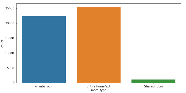
Single Variable Count Plot
Create a count plot showing the frequency of the different levels of the room_type column in the data DataFrame using Seaborn Countplot:
plt.figure(figsize=(10,5))
sns.countplot(x='room_type', data=data)
plt.show()
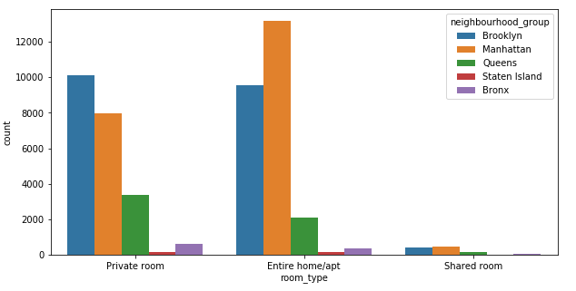
Two Variable Count Plot
Create a count plot showing the frequency of the different levels of the room_type and neighbourhood_group columns in the data DataFrame:
plt.figure(figsize=(10,5))
sns.countplot(x='room_type', hue='neighbourhood_group', data=data)
plt.show()
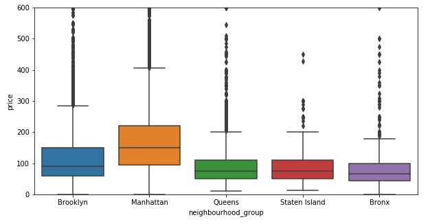
Box Plot
Create a box plot showing the price ranges for different levels in the neighbourhood_group column of the data DataFrame using Seaborn Boxplot. The range of the y axis has been set to 0 - 600 to improve the readability of the chart.
plt.figure(figsize=(10,5))
plt.ylim(0,600)
sns.boxplot(x='neighbourhood_group', y='price's,data=data)
plt.show()
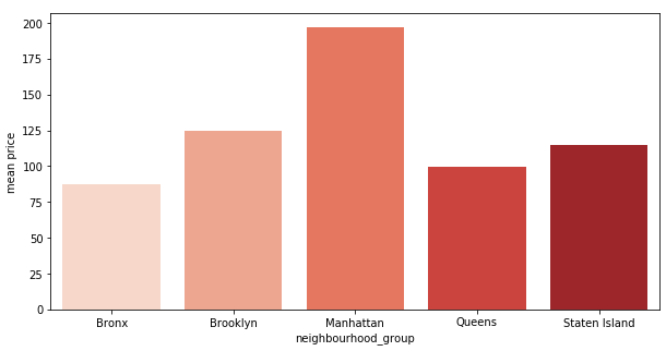
Comparing Means
Compare the mean price for each level in the neighbourhood_group column using a Pandas GroupBy and Seaborn barplot:
def compare_means(df,discrete_col,continuous_col):
group = df.groupby([discrete_col],as_index=False)[continuous_col].mean().reset_index(drop=True)
plt.figure(figsize=(10,5))
sns.barplot(x=group[discrete_col],y=group[continuous_col],palette='Reds')
plt.ylabel('mean ' + continuous_col)
plt.show()
compare_means(data,'neighbourhood_group','price')
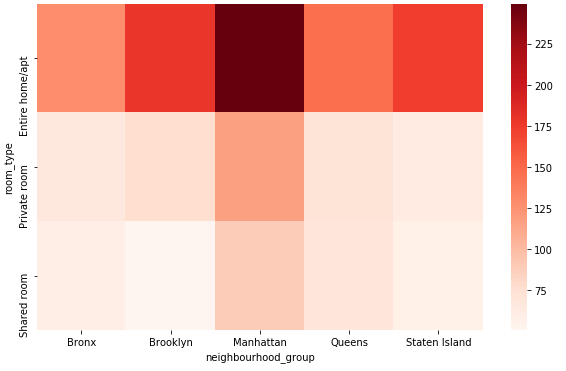
Discrete Variable Combinations
Compare the mean price for the combinations of levels in the neighbourhood_group and room_type columns using Pandas Pivot and Seaborn Heatmap:
def feature_interactions(df,feature1, feature2,continuous_col):
group = df.groupby([feature1,feature2],as_index=False)[continuous_col].mean().reset_index(drop=True)
pivot = group.pivot(index=feature1, columns=feature2, values=continuous_col)
pivot.fillna(0, inplace=True)
plt.figure(figsize=(10,6))
sns.heatmap(pivot,cmap='Reds')
plt.show()
feature_interactions(data,'room_type','neighbourhood_group','price')
.png)