.png)


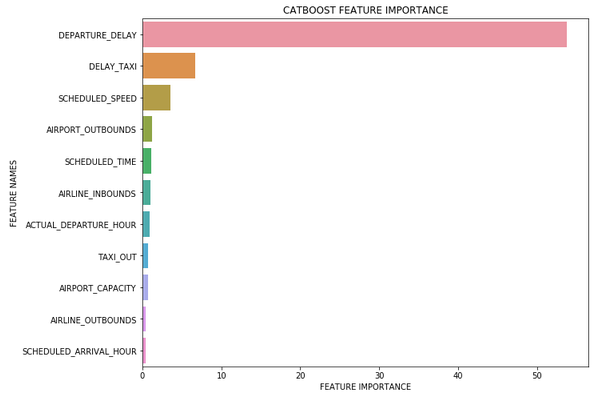
A big part of analysing our models post training is whether the features we used for training actually helped in predicting the target and by how much. Tree based machine learning algorithms such as Random Forest and XGBoost come with a feature importance attribute that outputs an array containing a value between 0 and 100 for each feature representing how useful the model found each feature in trying to predict the target. This gives us the opportunity to analyse what contributed to the accuracy of the model and what features were just noise. With this information we can check that the model is working as we would expect, discard features if we feel they are not adding any value and use it to hypothesis about new features that we could engineer for another iteration of the model.
However, the problem with the feature importance attribute is that the output is an unlabelled, unordered array of values so looking at it in isolation won’t tell us much about our model. So we are going to take this array and create a function that plots the feature importance data on a labelled and ordered Seaborn bar chart that will give us a more intuitive understanding of which features our model has deemed useful.
First let’s make sure we have imported all the required libraries. We are going to need Pandas, Numpy, Matplotlib and Seaborn. In this example we have already trained a Random Forest model using a data frame named “train_X” and named it “rf_model”.
Now to start with, we are going to declare the function “plot_feature_importance” and tell it what parameters we’re going to pass when calling. In this case we are going to pass in the feature importance values (importance), the feature names from training data (names) and also a string identifying the model type that we’ll use to title the bar chart.
Next we are going to cast the feature importance and feature names as Numpy arrays. This allows us to construct a two column data frame from the two arrays.
To construct the data frame we will use a Dictionary containing the feature importance values and the feature names where the Dictionary key will be the column names. Once this has been created we can then sort the data frame by feature importance value giving us a labelled and ordered feature importance data frame.
Finally we can use Matplotlib and Seaborn to plot the feature importance bar chart. Here we use the model_type parameter that we will pass to the function to give our plot it’s title.
Now we have created the function it’s time to call it, passing the feature importance attribute array from the model, the feature names from our training dataset and also declaring the type of model for the title.
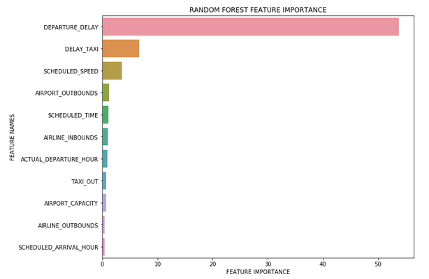
We can also use the function with other algorithms that include a feature importance attribute.